Status Post 04: Cronch is Back
Jan 20, 2026

Closed Tasks
UI Research for Metrics - Fei, Yi Huan, Sreeja
Due Date: 01/13/26
Task Time: Fei (2 hrs), Yi Huan (4 hrs), Sreeja (2 hrs)
Description: Three rounds of research testing led us to realize that we needed to conduct further research on our Metrics screen. This was a joint effort between the Research team and Design team to ensure seamless communication.
Deliverable: UI Research for Metrics
Takeaways:
It’s okay to go back to the drawing board
Important for Design and Research to work closely and ensure alignment
UI Research for the Budget Setting - Fei, Yi Huan
Due Date: 01/16/26
Task Time: Fei (1 hr), Yi Huan (2 hrs)
Description: Three rounds of research testing led us to realize that we needed to conduct further research on our Budget Setting process. This was a joint effort between the Research team and Design team to ensure seamless communication.
Deliverable: UI Research for Budget Setting
Takeaways:
It’s okay to go back to the drawing board
Important for Design and Research to work closely ensure alignment
Update Hi-Fidelity Prototype - Yen, Maria, Fei
Due Date: 01/19/26
Task Time: Yen (1hr), Maria (2.5), Fei (12 hrs)
Description: The whole team conducted a walkthrough of the latest high-fidelity prototype from last quarter to identify areas that needed updates or refinements. Based on the note, the design team reviewed feedback together and divided tasks among members to efficiently implement the changes.
Deliverable: Hi-Fidelity Prototype
Takeaways:
A full team walkthrough helped identify small inconsistencies and improvement opportunities
Dividing tasks allowed the team to work more efficiently and in parallel
Revisiting the prototype after time away provided a clearer perspective on necessary refinements.
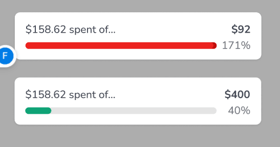
The Metrics screen is one of the most complex parts of the app since it presents multiple data points. Because of this, we want to ensure the graphs and data visualizations are meaningful, easy to understand, and genuinely helpful for users when tracking their spending and habits.
Status Post 04 - Maria
Due Date: 01/19/26
Task Time: Maria (1 hr)
Description: Status Post 04 is a required assignment for our Junior Project class. It involves documentation of closed tasks, open tasks, and new tasks. This allows our potential stakeholders, classmates, and the general public to view our progress via Framer.
Deliverable: Status Post 04
Takeaways:
Easier to do since we now have a system of documenting information and transferring them directly to Framer.
Allows us to organize where we are at with progress.
Live Link of the Website - Reuben
Due Date: 01/21/26
Task Time: Reuben (1 hr)
Description: Setting up the live website of the project on vercel.
Deliverable: Live Link to Website
Takeaways:
Vercel is easy to use with sveltekit as its compatible
Open Tasks
Sync and Organize Teams and Google Drive - Fei
Due Date: 01/27/26
Description: Reflect all changes made on Google Drive onto Teams
Alpha Functionality - Reuben
Due Date: 01/25/26
Description: Finishing up the alpha version of the backend functionality for each page, and creating documentation for the frontend side to implement into components.
Hi-Fidelity Usability Testing Script - Sreeja, Yi Huan, Fei
Due Date: 01/21/26
Description: Our team is aiming to shorten the script and ask questions that will produce answers that are more valuable to stakeholders. We are doing this in three separate drafts with support from the design team to ensure that we are not missing any questions that may need more clarity.
Components - Reuben, Maria, Yen
Due Date: 01/25/26
Description: Creating components based on what each page of our app needs, but making sure we are utilizing each asset and not redundantly creating the same component for a different page.
Alpha Frontend - Reuben, Maria, Yen
Due Date: 01/24/26
Description: Creating the initial alpha version frontend of our app based on our high fidelity prototype. Currently saving metric screens for the last to be developed.
New Tasks
Hi-Fidelity Usability Testing - Sreeja, Yi Huan, Fei
Due Date: 01/25/26
Description: This task involves conducting usability tests with users to validate our hi-fidelity prototype one last time before sending the product off to be developed.
Hi-Fidelity Usability Findings - Sreeja, Yi Huan, Fei
Due Date: 01/27/26
Description: This task involves organizing and analyzing relevant data retrieved from the usability testings to be reflected in our product.
Lobby Posters - Yen, Fei, Maria
Due Date: 02/23/26
Description: Brainstorm crucial information to put on a lobby poster. This includes creating or collecting graphics and writing content that captures our brand and interface.
Meetings:
All-hands Meeting: (01/06/26) | 1.5 hrs
Attendees: All team members present and on time
Meeting Agenda:
Agenda
Ground Rules (5 min)
Meeting Times (2 min)
Repositioning (18 min)
END at 11:50AM
Ground rules
Meeting Time:
All-Hands Meeting: Fridays 5:30PM - 7PM
All subteams will meet within teams this week
Roles Adjustment
Fei is now Secondary Designer (adj role) + Tertiary Researcher
Maria is now Tertiary Designer (adj role) + Secondary Developer (no change)
Yi Huan is now Secondary Researcher (adj role) + Project Manager (no change)
Repositioning
Home
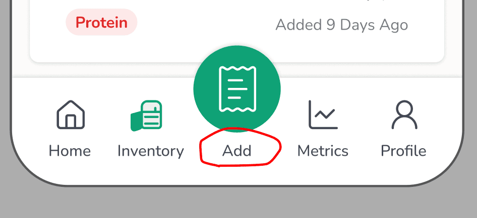
Scan → Add button
On click, 2 options show: “Add Manually” and “Scan Receipts”
Inventory: Add photo
Photo
A bit confusing as to the importance
Leave as is right now
Research: What photo do you think you’ll be adding?
Green tabs (“View All”)
All first letters in each word should be capitalized
Underline to indicate hyperlink
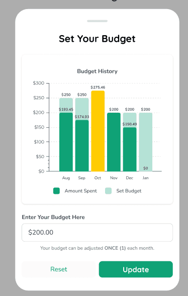
Budget Check → “Set Your Monthly Budget”
Allow options for “Yearly Budget” or “Weekly Budget”
Calculate weekly or monthly budget, and then have a section where it can be calculated in the span of a year
Consider “Here are your past monthly budgets”
Research: Ask users if they would prefer to budget monthly or weekly
Changing budget? Allow them to change it once a month
Shopping Lists
Names are editable - LOL CRASHOUT
Apple notes - press and hold to drag and reorder items on the list?
Backend and Frontend create linkage for list feature
Scope creep unless we finish our main flow
Probably should be an “X” on the right side, separate from checking it off
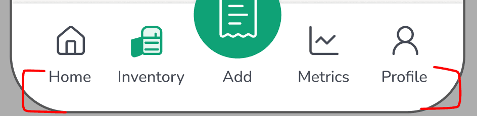
Navigation bar
Increase bottom space since “Home” and “Profile” look cramped
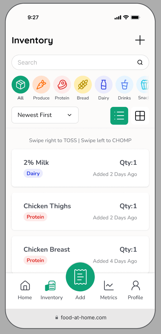
Inventory
“Add Item Manually” → Miscellaneous
Currently doesn’t have a background as a design choice
Slightly darker to match intensity of icon and other categories
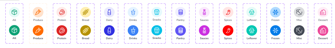
Inventory categories (e.g.: Produce, Bread)
Slightly darker to match intensity of icon and other categories
Scope creep
Drop down language
Change to “Newest First” and “Oldest First”
Chomp and Toss Animation?
Branding shouldn’t be shame-based, it should just be encouraging and make them want to use it
Test with users: how does this make you feel?
Scan
*See feedback above
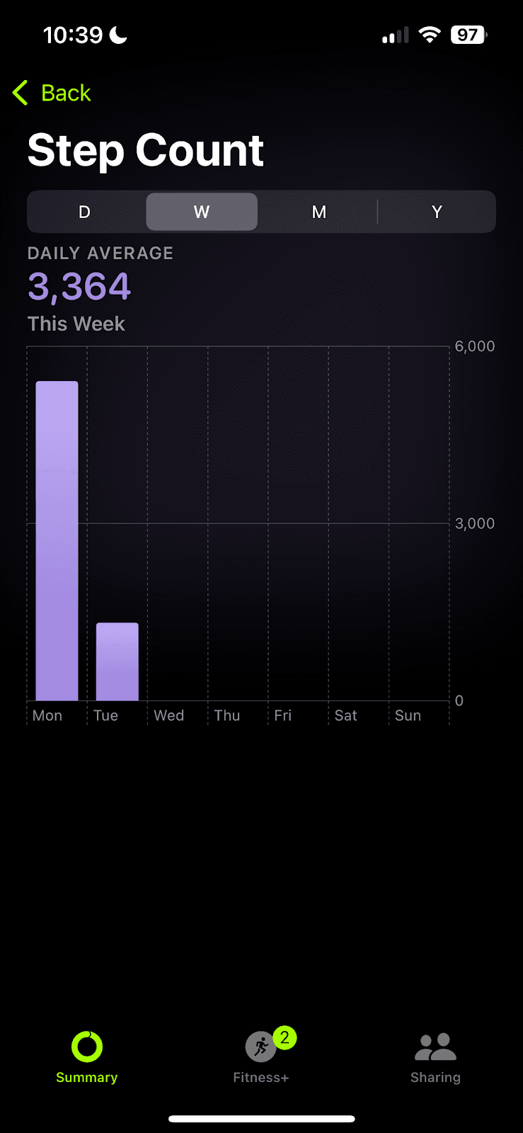
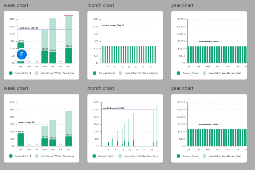
Metrics
Biggest portion with feedback
Make the x-axis more intuitive?
Only shows 7 days at a time – you have to scroll to view more
Year view? As a new years resolution
Scope creep
Calendar
Bar as a background instead of circles
Darker color: Lighter green? Just darker than what it is currently since we can’t see the color on the monitor
Dates → “November 23 – November 30”
Increase gap between the section
Font weight is heavy
Black got changed to dark gray
Research: figure out information, metrics, and graphs to be shown
Do research on what’s already on the market?
Did research with users, and some things were only mentioned occasionally
This is the graph we’re going to show
Make decisions on what to change and hand off those insights to design with concrete changes
Less time spent with design going back and forth, if research finalizes changes
References
Profile
Section headings should be lighter font color
“View All” button
Underline to indicate hyperlink
Swipe tabs could use more top and bottom padding
Critical Path 1: Add Item >> Upload Receipt/Manual Upload
Critical Path 2: Interact with Inventory Screen
Critical Path 3: Budget Setting
Critical Path 4: Interact with Metrics Screen
All-hands Meeting: (01/13/26) | 1 hr
Attendees: All team members present and on time
Meeting Agenda:
Agenda
General Updates
Design
Research
Development
Content
General Updates
Update your section and Jira tasks (5 min)
Update Jira for next sprint
Gantt Chart/Timeline
Status Post 04 FAH - Status Posts
Due Next Monday, Jan 19th @ 11 PM
Design
Closed Tasks
Home: Change “Scan” to “Add” in Navigation Bar✅
Shopping Lists: Press and hold to drag and reorder items✅
Navigation Bar: More bottom space → “Home” and “Profile” look cramped✅
Updated background color of categories (bread, produce, misc)
Open Tasks
Inventory Photo: @Research, what photo will you be adding?‼️
“A bit confusing as to the importance”
Manual Upload Screen >> thought it meant to add an additional receipt
Shopping Lists: Probably should be an “X” on the right side‼️
Instead of placing an X, should we consider consistent styling with swiping left to "Toss"? In this context, users would swipe left to “Remove”. Yes to this suggestion!
Web app layout (if look good, all other screen will be updated later today)
UI of android and Apple web browser look similar
Fei: will be done tonight. Promise !! …
Metrics pages
Budget on home screen
Profile: swipe tabs could use more top and bottom padding
To Do
Fix bug, prototype is not working cause of word changing
Research
Closed Tasks
UI Research for Budget Setting + Metrics FAH - UI Research
Findings are being integrated by Fei for the Metrics Page
Open Tasks
Hifi Usability Testing Script
Ask users what photo they think they will be adding
To Do
Numbers for the metrics screen (what is the average weekly/monthly budget, translate those numbers)
Hifi Script
Hifi Testing
Hifi Findings
Development
Closed Tasks
Open Tasks
To Do
DUE: AIM FOR ALPHA BY END OF WEEK 3
Save metrics screen for last*
Discussion points for Dev Meeting:
Will we be implementing research changes after this week?
Stick to the original/current high fidelity prototype or wait for full research changes?
Ensure proper padding for web-app (browser top and bottom safari)
Begin front-end
Create the Jira Tasks
Database organization
Planning out functions for each page
Starting with the homescreen development
Move on to other pages' development
Content
Closed Tasks
Open Tasks
To Do
Add
Yi Huan's screenshots
New UI research doc
Sketches for Metrics ✅
All-hands meeting: (01/18/26) | 1 hr
Attendees: Yi Huan, Yen, Fei, Maria, Reuben (Sreeja asynch)
Meeting agenda:
Agenda
General Updates
Design
Research
Development
Content
General
Update your section and Jira tasks (5 min)
1:1 hangouts with each other?
Everyone fill out w2m
Wheel of fortune 😀
Google form (revoked)
Status Post 04 FAH - Status Posts
Due TOMORROW, Jan 19th @ 11 PM
Fill out google doc tonight
Design
Closed Tasks
The prototype is working - should be good and ready for testing
Changes have been made based on the last run through
Open Tasks
Fei:
Metrics pages
Consulting w/ full team for:
Budget progress bar
Charts/graphs
Budget on the home screen yangyihuan4@gmail.com I think you took over some of this part?
We said it would be set to monthly. My challenge is how this appears on the daily/weekly/annual view
Profile: Swipe tabs could use more top and bottom padding (Maria)
To Do
Metrics screen (finish by today)
Budg- change $200 to $400 on budget screen
Research
Closed Tasks
UI Research for Metrics
UI Research for Budget Setting
Open Tasks
Hi-Fi Usability Testing Script (waiting to finalize)
Design Team look over
All other screens ready for testing
Waiting on metrics finalization (Fei)
Waiting on budget setting finalization (Yen)
To Do
Hi-Fi Usability Testing - (1/25 - Sunday)
Hi-Fi Usability Findings (1/27 - Next Tuesday)
Development
Closed Tasks
Open Tasks
Jira Status Post 04 setup complete: https://cronch.framer.website/project-status/status-post-04
To Do
ALPHA DUE THIS WEEK 01/24
Notes
Yen and Maria will split frontend items
Content
Closed Tasks
Open Tasks
To Do
Add
Yi Huan's screenshots
New UI research doc
Sketches for Metrics ✅
^ hoping to have all of this added by end of the day on Monday (1/19)
Design Meeting: (01/07/26) | 0.5 hr
Attendees: Yen, Fei, Maria
Meeting Agenda:
Discuss meeting time
Wednesdays at 9 PM
Start implementing changes to hi-fi prototype
Each team member pick a section to work on
Yen
Fei
Maria – Completed! Please refer to the Figma file for details.
Complete by Tuesday 01/13
Changes:
Change layout from phone mockup to webapp
Change heading size
Home
Scan → Add button✅
On click, 2 options show: “Add Manually” and “Scan Receipts”
Inventory: Add photo
Photo
A bit confusing as to the importance
Leave as is right now
Research: What photo do you think you’ll be adding?
Green tabs (“View All”)
All first letters in each word should be capitalized
Underline to indicate hyperlink
Budget Check → “Set Your Monthly Budget”
Allow options for “Yearly Budget” or “Weekly Budget”
Calculate weekly or monthly budget, and then have a section where it can be calculated in the span of a year
Consider “Here are your past monthly budgets”
Research: Ask users if they would prefer to budget monthly or weekly
Changing budget? Allow them to change it once a month
Shopping Lists (scope creep)
Apple notes - press and hold to drag and reorder items on the list?
Backend and Frontend create linkage for list feature
Scope creep unless we finish our main flow
Probably should be an “X” on the right side, separate from checking it off
Navigation bar
Increase bottom space since “Home” and “Profile” look cramped
Inventory
“Add Item Manually” → Miscellaneous
Currently doesn’t have a background as a design choice
Slightly darker to match intensity of icon and other categories
Inventory categories (e.g.: Produce, Bread) - done
Slightly darker to match intensity of icon and other categories
Scope creep
Drop down language - done
Change to “Newest First” and “Oldest First”
Chomp and Toss Animation? - in progress
Branding shouldn’t be shame-based, it should just be encouraging and make them want to use it
Test with users: how does this make you feel?
Metrics
Biggest portion with feedback
Make the x-axis more intuitive?
Only shows 7 days at a time – you have to scroll to view more
Year view? As a new years resolution
Scope creep
Calendar
Bar as a background instead of circles
Darker color: Lighter green? Just darker than what it is currently since we can’t see the color on the monitor
Dates → “November 23 – November 30”
Increase gap between the section
Font weight is heavy (done)
Black got changed to dark gray
Research: figure out information, metrics, and graphs to be shown
Do research on what’s already on the market?
Did research with users, and some things were only mentioned occasionally
This is the graph we’re going to show
Make decisions on what to change and hand off those insights to design with concrete changes
Less time spent with design going back and forth, if research finalizes changes
Profile
Section headings should be lighter font color ✅
“View All” button ✅
Underline to indicate hyperlink ✅
Swipe tabs could use more top and bottom padding
Research Meeting: (01/09/26) | 1.5 hrs
Attendees: Sreeja, Yi Huan, Fei
Meeting Agenda:
Agenda
Home - Budgeting UI Research due Sunday 1 pm
Metrics UI Research – due Sunday, 1 pm
Testing Timeline - research will
Design Team Updates
User Research Points
Hi-Fi Usability Testing Script
Action Items
Metrics Page - Fei will be handling the design of the metrics screen
User Research Points
Home
Inventory: Add photo button on manual upload screen
Research: What photo do you think you’ll be adding?
Budget Check → “Set Your Monthly Budget”
Allow options for “Yearly Budget” or “Weekly Budget”
Calculate weekly or monthly budget, and then have a section where it can be calculated in the span of a year
Consider “Here are your past monthly budgets”
Research: Ask users if they would prefer to budget monthly or weekly
Changing budget? Allow them to change it once a month
Metrics
Research: figure out information, metrics, and graphs to be shown
Do research on what’s already on the market?
Did research with users, and some things were only mentioned occasionally
This is the graph we’re going to show
Make decisions on what to change and hand off those insights to design with concrete changes
Less time spent with design going back and forth, if research finalizes changes
UI Research
Home
Metrics
Mint Mobile
Apple Health
Strava
Rocket Money
If stumped in the design process, even with inspiration and research, go through the script for the Metrics screen for further resources on
Finalize findings by Sunday @ 1 PM
Fei will take the findings and create the changes
Claim specific apps?
Note repeated concepts (more validation for design changes)
UI Research Folder to input findings
Testing Timeline
Hi-Fi Testing: 1/13 - 1/20
**The pace for research has been 1 week to write the script, interview, and analyze findings
Usability Testing Script
Should make the script shorter; audit portions where we ask less questions and still get enough feedback
Anything that stood out to you positively, negatively, or anything that can be improved?
Consider pushing out a secondary screener survey to collect quantitative data – Get graphs
Action Items
Meeting next Tuesday 7-8 PM, and Wednesday, 6-7 PM, following that
Finalize a testing timeline to determine when each part of the research/ testing should be complete
Finalize findings by Sunday @ 1 PM
Usability Testing Script Changes will be done in next meeting
Testing will be done that ongoing week
Research Meeting: (01/13/26) | 1 hr
Attendees: Sreeja, Yi Huan, Fei
Meeting Agenda:
Agenda
Done
UI Research for Metrics Screen
Open
UI Research for Budget Setting (Yi Huan)
Hi-fi Usability Testing Script (All by 1/14 6 PM)
Status Post 04 (All by Sat 6 PM)
Update Jira Tasks (Yi Huan by Sat 6 PM)
New
Hi-fi Usability Testing
Hi-fi Usability Findings
Hi-fi Usability Testing Script
General things
Work in DRAFT 2 tab and make direct changes to the document (no comments/suggestion mode)
Language surrounding “scan receipts” needs to be changed to “add items to inventory”
Research Questions from Repositioning Meeting
Research Questions from Repositioning Meeting:
Home
Home>> Add Item Manually >> Add photo
Research: What photo do you think you’ll be adding?
Budget Check → “Set Your Monthly Budget”
Allow options for “Yearly Budget” or “Weekly Budget”
Calculate weekly or monthly budget, and then have a section where it can be calculated in the span of a year
Consider “Here are your past monthly budgets”
Research: Ask users if they would prefer to budget monthly or weekly
Changing budget? Allow them to change it once a month
Inventory
Inventory categories (e.g.: Produce, Bread)
Slightly darker to match intensity of icon and other categories
Scope creep
Research: ask users about the visibility and readability of the inventory icons
Chomp and Toss Animation?
Branding shouldn’t be shame-based, it should just be encouraging and make them want to use it
Test with users: how does this make you feel?
Metrics
Biggest portion with feedback
Make the x-axis more intuitive?
Only shows 7 days at a time – you have to scroll to view more
Year view? As a new years resolution
Scope creep
Calendar
Bar as a background instead of circles
Darker color: Lighter green? Just darker than what it is currently since we can’t see the color on the monitor
Dates → “November 23 – November 30”
Increase gap between the section
Font weight is heavy
Black got changed to dark gray
